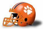
1. Halifax Spitfires
It doesn't get any better than this one. A cat's paw on an orange helmet...genius!
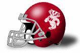
2. Bucky's Goodgers
Nice Bucky logo on a beautiful red helmet. I also like the throwback look of the grey facemask.
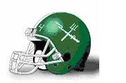
3. Minnesota Fighting Farmers
Ah, the classic gun and pitchfork logo. Very appropriate logo for the Fighting Farmers, but not that aesthetically pleasing on a helmet. Though I do like the throwback look of the numbers on the front of the helmet.
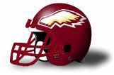 4. Golden Goblins
Yeah, Goblins have wings I guess...and the colors are correct, but its just not that interesting. I think it should be the goblin logo thats on the rosters page on a maroon helmet....maybe with a stripe or two.
1 comment:
I'd have to go:
1. Farmers -- pitchfork/gun design perfect!
2. Goodgers -- Love the Goodger -- Like no stripe
3. Spitfires -- Clemson
4. Goblins -- Eagles -- Why not the ASU Sun Devil?
Post a Comment